
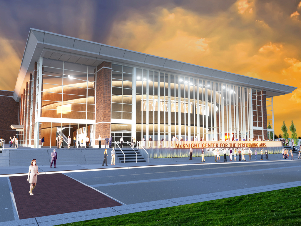
McKnight Center for the Performing Arts
The McKnight Center for the Performing Arts is the newest addition to Oklahoma State University that will redefine Oklahoma State’s influence in the arts with an all-new, unique program to Stillwater. The McKnight Center will feature both nationally and internationally known programs and performances that will educate and entertain both students and alumni, giving way to once in a lifetime opportunities to be offered.
While creating a brand for the McKnight Center, we wanted to visually represent Stillwater’s love for the arts and cultural diversity. We chose four words to describe what elements we wanted the logo to convey which were space, emotion, motion, and dynamism. We believe these elements are critical to the building and wanted to mirror them in the logo. The space being created by the performers on stage, the emotion being drawn and evoked from the viewer, the fluid motion of the performers, and the dynamic stories being performed.
We believe we included all of these elements and created a logo that is visually striking as well as clear and legible. The M silhouette representing McKnight stands out from a distance and commands attention while the orange lines in motion create the outline of the C. The subtle gradient coming from the middle of the M pushes the middle of the logo back to create space in the logo. All together this creates an icon that reflects all of the attributes of the McKnight Center while also being unique and bold enough to stand out.
Collaboration with Baylee Field
2018 Aiga Blue Ridge Flux Design Competition Silver Award


Nighthawks food truck
Ed Hopper has a way of using light and color to create visually striking paintings that you can't help but gravitate towards. I wanted to mimic this allure with the branding for my Nighthawks inspired food truck.
For this project our challenge was to create a unique brand for a restaurant of our choosing. It could be a real restaurant or one we came up with. I took this as a challenge and attempted to make my entire project inspired by Ed Hopper's most famous painting 'Nighthawks'. I settled on Philly Cheesesteaks, inspired by the Phillies cigar sign above the scene, and milkshakes, a staple in old school diners. The colors used are all pulled directly from the painting with the eerie blue-green becoming the primary color. The warm yellow and fluorescent white are used to break up the blue-green and mimic the area of warmth in the painting. The font Modesto was as close as I could get to the font used at the top of the painting. The serifs and unique letterforms pushes the logo back in time and creates a vintage logo with a modern twist.
For the brand packaging I pulled sketches from Ed Hoppers notebook that he was using to prepare for Nighthawks. By combining all of these elements I feel like I created a brand that is successful in tandem with the painting as well as being strong enough to stand apart on its own merit.


oklahoma state football student worker
While I was a student at Oklahoma State I had the opportunity to work for the football team as a Graphic Design Student Worker. I created graphics for Oklahoma State Football social media accounts as well as recruiting graphics to be sent to future Cowboys. These graphics needed to appeal to high school kids looking to play football at the next level. Because of this we constantly focused on trying new things while still making sure we stayed true to the Cowboy brand.
These graphics typically focused on the recruit and were very custom. When designing them we made sure to keep in mind that we would have to change the name and number on each one. Each week we designed another template so we had to be diligent with our pursuit of originality. The resulting designs were modern, busy, clean, and intentional. It was an awesome experience seeing some of the players I helped recruit, commit to the team, and eventually become key players for Oklahoma State.


Barrett JAckson auto auction pamphlet re-design
The Barrett Jackson Auto Auction is known nationwide as one of the largest car auction events in the country. It attracts the wealthiest buyers and the craziest cars. With this project I wanted to create an auction catalogue that was just as cool as the cars being sold.
This design started with a complete redesign of the Barrett Jackson logo. The old logo, which is simply a script font, did not fit the direction I wanted to go with the brand. The new logo is inspired by an auto tail light and contains the initials BJ for Barrett Jackson. By skewing this logo it adds movement and momentum that is mirrored in the classic cars.
After re-designing the logo I tackled the car catalogue. I wanted all of the same elements I used to create the logo to be used in the pamphlet as well as increase the user experience. An example of this is including the bidder card on to the back of the booklet instead of tucked into it. This helps the user stay organized as well as making it easy to keep track of.


